
A recent custom piece, which started back in the Summer, was done honoring a trio of sisters that played their high school lacrosse at the same school. The one pictured in the middle just played her final high school game, capping off and honoring a unique experience for all. A picture was taken and the request for a commission to replicate it in pen and ink was made.
Most of the custom commissions are sports action-related. The project of illustrating standard portraits was a good exercise to execute. Here are the progress pics showing the work.
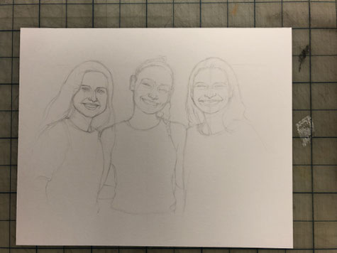
The pencil stage in this was very important, setting the pace to really look at fine details that could be taken as an 'automatic ride'.
For example, all the eyes on each person are not on a linear segment as individual heights and sizes have to be taken very seriously.
Once the first marks of ink are placed, the framework, sort-of-speak, is being built and things start to happen.


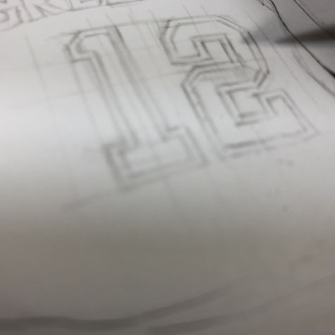
Suddenly, the my old, archaic Typography class back in art school comes back to mind.
Points, picas and all those terms in that boring class are in my head and go on the paper. It's so funny how anything comes back to you at a later time.
Also, keep in mind, that original typeface setters didn't have Microsoft Word to create type. Stuff was hand drawn, or 'lettered'.


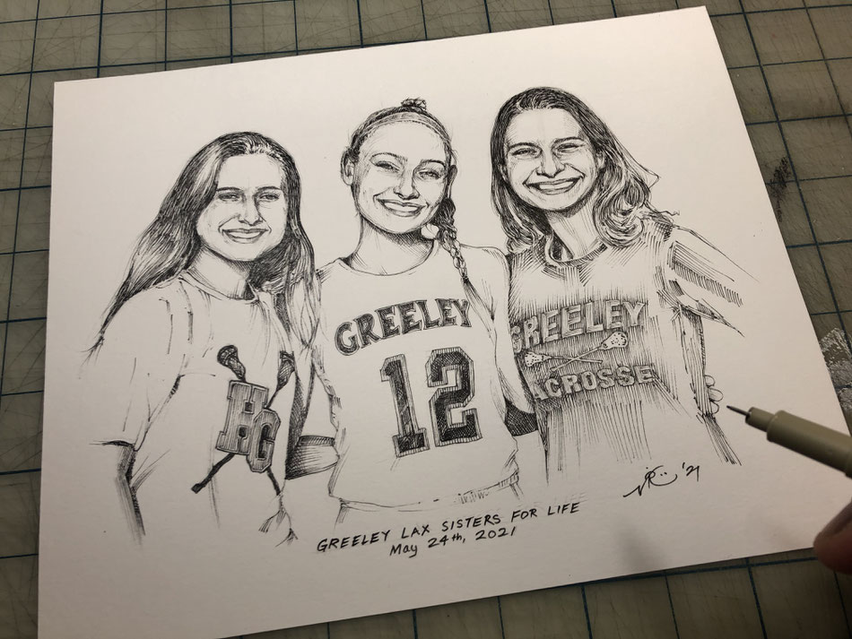
As directed, the title was placed on the bottom of the piece, along with the date of the last game played and when the photo was taken.
As a parent of two boys, who play in their respective youth lacrosse teams, I couldn't help but think of them while looking at the end result in front of me, on my drafting table. Siblings are the best teammates.


Write a comment